Laying the foundations: the TELUS Design System architecture
Content and Design · Aug 2, 2018
Key takeaways:
A Design System is necessary when scaling a large team and it requires a dedicated team
The TELUS Design System helps developers build websites quickly, consistently, and with a high regard for accessibility
Finding the right tools to build a design system is a constantly-evolving practice that inevitably requires iteration and improvement
Fostering a community of developers and designers is necessary to scale up the system
TELUS has a growing team of developers, designers, and content writers surpassing 1000 people. We have teams distributed across Canada and the world in several offices and time zones.
Since 2016, TELUS digital has been working to produce a scalable suite of tools, frameworks, practices, strategies, and reusable patterns. We call it the “Digital Platform” and its accompanying documentation is the Reference Architecture; it has been instrumental in helping product teams deliver solutions efficiently, and in a sustainable manner. One of the challenges of creating and maintaining such a platform is to enable teams to adopt and improve the system swiftly, with low friction, and with the power to do so asynchronously.
One of the products of the Digital Platform is the TELUS Design System (TDS). Design Systems are built, consumed, and maintained by companies and other cooperatives worldwide, big and small, to help them deliver consistent user experiences as new projects are formed. Consumers of TDS gain these benefits with the help of our asset library for Sketch, which we cover in another blog titled, “Beyond style guides: lessons from scaling design at TELUS”, as well as coded components.
TDS helps teams deliver experiences that are consistently on brand, accessible, and with minimal repetition.
Core team and core values
Since TELUS produces websites at high scale and speed, with new designs being deployed to production multiple times per day, this operation demands a lot from TDS. TELUS fosters a culture of building awesome things, and awesome things start with an awesome team.
As a product, TDS currently has its own product team of four developers, two designers, and a product owner. With a dedicated team to gather user needs, scheme innovative solutions, and act upon them, the path leading to desired outcomes is set up for success.
The human aspect is critical for every software development product. Key concerns are continuously addressed within the core team in order to prevent distractions and maintain motivation for everyone involved:
We make sure everyone is aligned on the roadmap at all times
Though we generally work independently as our individual preference, we always allow ourselves to be made available for each other when needed
Every two weeks we hold a team retrospective and make sure the well-being and overall happiness of team members are discussed
We write user stories for all work, however big or small, so that ad-hoc tasks do not get piled up in people’s individual notebooks
With a team technically and mentally equipped with the right philosophies and tools to perform well, the right practices can be formed and embedded in the product. These practices directly translate into code and architectural decisions.
Core component architecture
The TELUS Design System features a suite of coded components made with the intent of easier discoverability, consumption, and long-term maintenance. When a designer completes a page in Sketch, they can communicate which parts of the page are from the design system, by name, which their co-developer can look up at https://tds.telus.com/ and consume in their application. Since TELUS promotes the concept of inner source, individuals can suggest changes to our components directly in code.
In August 2017, our team aligned on a set of tools and frameworks to help build a healthy codebase that enabled rapid development of widely-used components. Like every other software project at TELUS, we first based our decisions on the Reference Architecture. These baseline decisions include:
Building components using React; since every TELUS application is obligated to use React, our component library would be most widely consumed by React applications
Deployments using Red Hat OpenShift
With these decisions resolved, we had the freedom to choose other tools for the build-out of our React component library. While building with React, which is a JavaScript library that encourages the development of reusable components, we kept in mind a couple of key needs that needed to be satisfied:
Some of our websites, both old and new, featured inconsistent experiences loosely based on documented practices. By building design-driven components with restricted variation, we can have more conversations with teams when the Design System does not work the way they expect
TDS needs robust and simple component interfaces that allow the correct amount of variation in order to attract repeated use by development teams. This speeds up development time, increases satisfaction with the Digital Platform, and in turn produces consistent user experiences across our numerous sites
Design-driven components
One of the core goals of TDS is to provide coded elements that directly reflect approved designs. For example, we have this button:

Previously, while TDS was a Cascading Style Sheets (CSS) class-based design system, this button could be coded in the following way:
<button class=”button button--primary”>Find out how</button>
This basic example only requires two classes: “button” and “button--primary”. Even when documented well, this can be prone to human experimentation. It is imperative for buttons to contain the correct combination of classes to achieve a desired aesthetic, but what if a page calls for a larger button? Nothing is stopping a designer or developer from achieving this:

<button class=”button button--primary” style=”font-size: 2rem;”>Find out how</button>
TELUS has over 1000 web pages, built and maintained by dozens of teams. As we were standing up the new React-first design system, we immediately realized that the CSS-only approach would not work long-term due to so much potential for misuse, and no easy way to audit everything. Though we could manually audit every web page, it is a time-consuming task that is purely reactionary.
At TELUS, the process of approving new designs begins with a conversation led by one or more designers. Once they bring forward a new design to their respective design lead, the lead brings that forward to the Design Direction team for approval. Designs that are approved by the Design Direction team are consumed and codified by the TDS team once, and then development teams can re-use TDS repeatedly without having to re-code these designs on their end. This may seem a bit bureaucratic, but keep in mind it is challenging to keep every designer up-to-date with the ever-evolving experiences that represent the TELUS brand.
We wanted to instil the mindset of design-driven development: once designs are approved and in production, modifications or new design patterns must undergo re-approval by our Design Direction team. In order to enforce that in code, we restricted the use of React component props ‘className’ and ‘style’.
This way, only the approved variants of Button could be rendered, which also proved to be a reliable and simple interface for developers.

<Button>Find out how</Button>
<Button variant="secondary">Submit</Button>
In the React code above, you can see that the green ‘primary’ colour is shown by default, and the variant ‘secondary’ can be specified. Rather than having to choose among a combination of 4 or more CSS classes, the consumer only needs to specify whether the variant is ‘secondary’, ‘inverted’, or the default ‘primary’. All of these options are documented in the TDS component catalogue.
At this point, a set of atomic designs become a component: a codified use case with only approved variations made available that have all accessibility and functionality considerations built-in while exposing some parts that may be necessary for customization.
With restricted styles, teams can be made aware of the latest trends led by our Design Direction team. For example, if a TDS component does not appear or function in a way developers or designers expect - such as a button not being able to show large text - we can have a conversation with them early in their development phase, improve our documentation or components, or help lead teams to an improved design.
Simple component interfaces
"Simple things should be simple, complex things should be possible" - Alan Kay
Simple interfaces are achieved when you can make a complex group of elements available through small amounts of code that have accessibility considerations, style variations, and common use cases fully addressed. Some components have somewhat complicated requirements, which may involve several lines of code that must be repeated accurately across our hundreds of web pages. This situation has the potential for error, mishandled implementation details, or inconsistent user experiences.
One example we have in the TELUS Design System is the Input component. A traditional Input setup that includes error feedback would be coded like this:
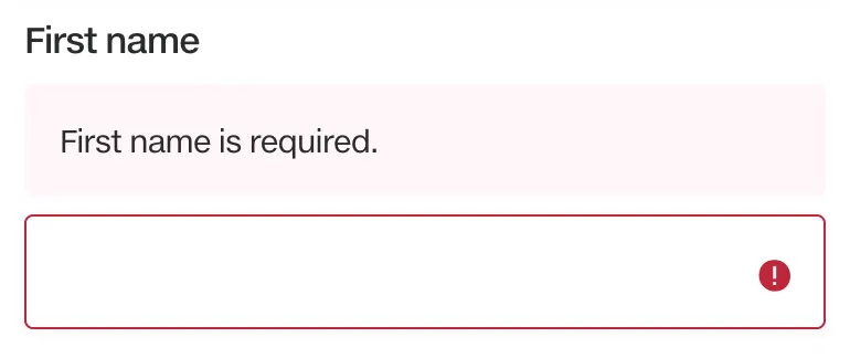
<div class=”field field--error”>
<label for=”omitted-field”>First name</label>
<div class=”helper helper--error” id=”omitted-field-error”>
<strong>First name is required.</strong>
</div>
<div class=”field__control”>
<input type=”text” id=”omitted-field” placeholder=”First name”
aria-describedb=”omitted-field-error” aria-invalid=”true”>
</div>
</div>
If any developer had to replicate this input flow using a CSS library, they would be responsible for the label, error message position and state, and `aria-*` attributes. It is a lot of code to repeat across hundreds of web pages, with potential for error that may compromise the brand and user experience. All of these can be encapsulated in a React component:
<Input label=”First name” error=”First name is required” />
In one line of code, a developer can set a label and error message to compose an Input component with the correct state and accessibility attributes. The `label` prop is also mandatory, which embodies our design-driven goals in a simple component interface.
With simple component interfaces, there is less room for error, the implementation details are handled by the TDS team, development time decreases, and user experiences are consistent. TDS components also have accessibility considerations built-in, allowing visitors using screen readers, keyboards, or alternative human-computer interfaces to have a proper navigation experience. As an added benefit, developers can upgrade components like Input with little to no re-writing of code.
Evolving the architecture
In August 2017, we set out to build the new React-based TDS components, which is a single npm package containing highly reusable components for customer-facing websites. We initially sought to encourage teams to use these new React components and move off the legacy CSS library as fast as possible, which would help them build websites more easily and consistently. With every release of TDS, we would add a new React component and deprecate any CSS classes related to that component to be removed a few releases later. This way, teams looking to upgrade must refactor their use of CSS classes every few releases.
With a release cadence of every two weeks, we continually released new React components and sometimes made breaking changes to the legacy CSS library. After a few months of releases, we gathered lots of feedback from tech leads and developers at TELUS digital who were consuming TDS. The bi-weekly breaking releases model was met with criticism:
Teams had to fit TDS upgrading into every sprint, which was not realistic in most teams due to timing constraints
Patches for components made a few releases ago would be tougher to consume since there may be necessary refactoring for other breaking changes
Teams wanted to contribute to TDS, but the core team could not dedicate enough time to review their designs or code
Some notable software such as React has established acceptable practices when it comes to release cadences. For example, the time between major React releases is about one year. Imagine if React released breaking changes every two weeks; thousands of developers wouldn’t be able to reasonably keep up, and its adoption would drop off. This is also true for a design system on a large-scale team; developers consuming the system should be given a reasonable timeframe to upgrade, and with a fair early warning when breaking changes should occur.
As releases continued to be made available in TDS, defects were discovered by consumers along the way. These defects later received patches in newer versions of TDS, but those newer versions had breaking changes as well. Consider this shortened changelog from versions v0.20.0 to v0.28.2:
0.20.0 - feature (August 14, 2017) new Button component released
0.21.1 - feature add `inverted` variant for Button
0.25.0 - breaking change remove legacy Button CSS
0.26.0 - breaking change remove className and style props from Card component
0.27.0 - breaking change remove legacy Link CSS
0.28.0 - breaking change remove legacy typography CSS
0.28.1 - patch fix horizontal centring of Button on Safari
0.28.2 - patch (November 6, 2017) add missing inset spacing for Button
If a team were to adopt v0.20.0 of TDS, but wouldn’t be able to upgrade again until v0.28.2, then they would be met with several breaking changes unrelated to the Button component. It was not possible to receive patches for specific components without affecting others during this lifecycle, which turned out to be a pitfall of our monolithic TDS package.
Even though the breaking changes were communicated responsibly via warnings in code and announcements, it’s not always possible to make TDS a high priority for teams. Conversely, if teams were to adopt every version of TDS as they arrived, it would require lots of refactoring every two weeks, which would take too much time away from their own tasks.
Providing an agreeable cadence
After digesting everyone’s feedback, we decided to forego any breaking changes to the legacy CSS library until v1.0.0 was released. Version 1.0.0 was designed to include a monolithic package of thirty-six identified ‘core’ components, and none of the global CSS classes from previous versions. We released TDS v1.0.0 on January 30, 2018, and teams were able to upgrade confidently to v1.0.0 knowing there would not be any breaking changes until we split up the components into independent packages.
Lastly, teams wanted to contribute more components to TDS since they found the case of having a repository of reusable components valuable within their tribes. The core team cannot scale potentially hundreds of components on their own, so we developed a library called “Community Components”, which we’ll go over near the end of this post.
The current state of TDS core components architecture
On March 8, 2018, we released “Split Components”, a collection of npm (Node Package Manager) modules under the @tds/core-* namespace. Split components are a direct response to the pitfall of consuming a monolithic component package: teams could not manage the upgrade cycle of individual components without unintentionally affecting other components. With independently split components, developers can more easily make time to upgrade one component at a time without affecting other components in their application.
Since we began developing React components in August 2017, we have been using the following tools to build a healthy codebase, a catalogue of components with self-documented props and hand-written guides, and scoped CSS. With the addition of split components, we added Lerna.
Styleguidist: isolated React component development environment with a living style guide
Rollup: a JavaScript module bundler, similar to webpack, built with ES2015 modules in mind and optimized for libraries.
ES2015+: We write all JavaScript as ES2015 modules, generally following the comprehensive AirBnb style guides for JavaScript and React, and then transpile it for the browser with Babel
Linters and Prettier: standardize code style and format
CSS Modules: facilitates the buildup of scoped CSS while maintaining the familiar interface of Sass
Yarn: we chose Yarn as our node package manager for its speed and deep dependency version locking
Lerna: A tool for managing JavaScript projects with multiple packages.
The benefits and shortcomings of noteworthy tools
Back in August 2017, we chose React Styleguidist as a documentation generator due to its feature-rich configurations. The enables us to transform documentation written in Markdown to render using our own typography components, giving the final documentation a TELUS branded aesthetic. It is especially useful to have PropTypes documented using JSDoc within the components’ source code, and having Styleguidist render Prop tables automatically - that way we can use code as documentation, avoiding potential duplication or neglect.
As a cataloguing tool, Styleguidist is great as it showcases all of our components on a single page. It can also interpret code comments to produce usage tables for each component; this way we only need to document our code once and it will be shown in the final catalogue. However, as the number of components grow and the need to communicate their quality becomes more necessary, we will look into other cataloguing solutions that are a better fit for the scale at which we operate. For example, we need developers to be able to backtrack to documentation for past versions of components, designers need access to Sketch assets; and everyone should clearly see what measures were taken to ensure components are performant, accessible, and approved by Design Direction.
Rollup was adopted at an early stage for its ability to optimize imported code - which helps keep the size of components small. Performance optimizing is an ongoing effort within the core team, and we will continue looking into ways to build more compact, performant components.
CSS Modules were very helpful as we transitioned from our pre-existing Sass styles. When components import styles from CSS Modules, they generate a scoped classname. For example: when the Button component imports a class name ‘primary’ it would build as ‘TDS_BaseButton-modules__primary__2lxya’, which gives it a unique class name. On a given web page, these built class names would get injected to the of a page, but the order they appear is indeterminate. Consequently, when we created higher-order components such as the FlexGrid, there is no straightforward way to override a wrapped component’s styles.
We are currently evaluating some CSS-in-JS solutions to see if we can compose CSS in components and reduce the amount of built CSS included in component packages without compromising page performance.
Last, but not least, is Lerna, which helps us orchestrate the versioning, changelog-writing, peer-dependency management, and deployment process of our growing assortment of React components. It’s extremely powerful but had a large learning curve. Using conventional commits, we are able to note breaking changes, features, or fixes with every commit, and then Lerna will parse those commits to determine version bumps. This requires a bit of discipline, and commit linting. In order to be successful, we followed these rules:
Only make commits to files for a single scope. If a commit includes changes for the button component, there should not be any changes for other components in that commit
Define scope in a way that Lerna understands. For example, a feature commit that changes the colour for a package named @tds/core-button requires the format: feat(core-button): change colour
Make pull requests and reveal which components will change and to what version. To facilitate this, we created a script that outputs version bumps determined by Lerna
With these rules, we can smoothly make changes to individual components and expect them to publish and bump versions predictably. The example commit from the rules above would lead to the following version bump output, assuming the current version of Button is v1.1.1
Changes:
- @tds/core-button: 1.1.1 => 1.2.0
You may freely observe our codebase setup in tds-core on GitHub.
Community components, shared architecture, and next steps
With independently-versioned components, teams can now fully separate concerns from each component and perform upgrades on their terms. Though core components are widely utilized in every front-end application at TELUS, lots of teams have their own specialty components that have moderately high reusability. We call these specialty components “community components”, and they are loosely governed by a guild known as the Digital Platform Ambassadors. Jack covers this topic extensively in an upcoming blog titled, “TELUS Design System: Building a community”. TDS community components are backed by a distributed governance model, which allows representatives outside the core team to approve changes to components as the amount of maintenance time required for these components exceed the amount of time available to the core team.
Community components are built and versioned in a mono-repository using the same tools as tds-core. Using Lerna, community components are published to npm under the @tds/community-* namespace. All discussions, roadmaps, and source code live in a centralized repository. This way, as we evolve the architecture of tds-core, we can replicate these changes in tds-community.
Our next steps are to take on big scaling challenges the design system is facing:
Make components more performant by minimizing javascript bundles and optimizing CSS usage. Components are being used across hundreds of pages, so even a few milliseconds saved can translate to hours per day. This is critical in saving time for the customer, and server costs for TELUS
Assure teams are using the latest versions of components by automating upgrade notices and developing refactoring tools as needed. We need teams to always be on the latest version of TDS to produce consistent experiences, and we are in a position to make that process easier
Converge the disparity between designer assets and React components by combining them, leading to a single source of truth for component variance and dimensions. By shortening the time from design to code, we can expect more consistency as we iterate
Have components cached across TELUS websites, so that site visitors only need to download them once as they browse multiple pages. Though this is related to page performance, it’s also critical for handling site widgets that are also consuming TDS. When these widgets get inserted onto a page, their styles could adversely affect the rest of the page with style overrides, and we must do our part in preventing that
We’re excited to bring more innovation to the TELUS Design System’s architecture, leading to easier adoption, faster development turnaround, and consistent and pleasurable customer experiences.