Accessibility: designing for ALL
Content and Design · Sep 21, 2015
Accessibility is a top concern at TELUS Digital. It’s one of our guiding principles and part of our digital standards. At the heart of it, designing with accessibility in mind means designing for all people. In other words, inclusive design.
As a UX designer, I work closely with a cross-disciplinary team to ensure that the online experiences we deliver are available to customers using various assistive technologies.
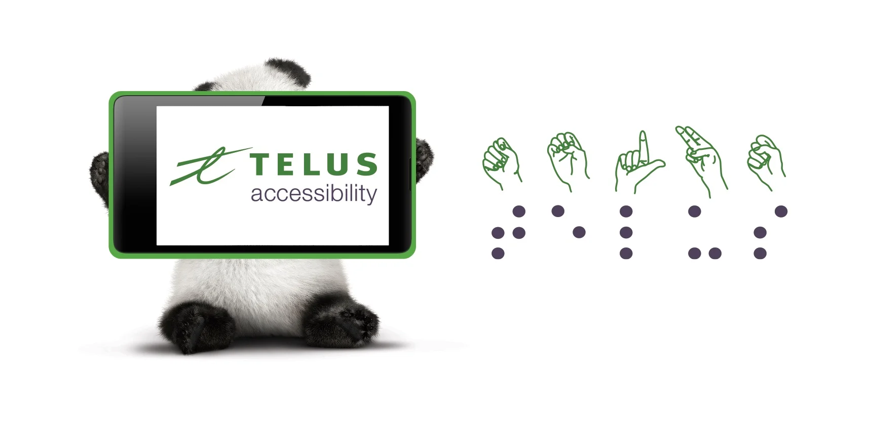
TELUS accessibility sticker – Panda holding a cell-phone with “TELUS accessibility” on the screen. TELUS is also spelt in sign language & braille.
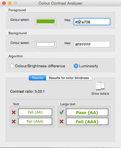
In my role as a design lead, I have spearheaded the updating of the online colour contrast standards to ensure we hit a minimum colour contrast ratio of 4.5:1 (and meet the WCAG AA standards).
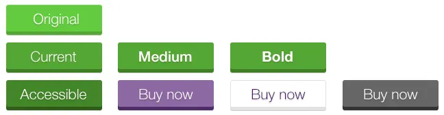
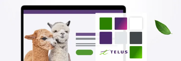
Updating the main buttons on the Telus.com site with the Colour Contrast Analyser, exploring different colours and font weights.
Following this, a small group of typography enthusiasts on our team (myself included) reviewed our super thin/lightweight font, which struggled to display properly on anything short of a retina screen in a dark room. We put in motion a shift in font weight for screen readability, to eradicate those outliers meant for ink and paper only.
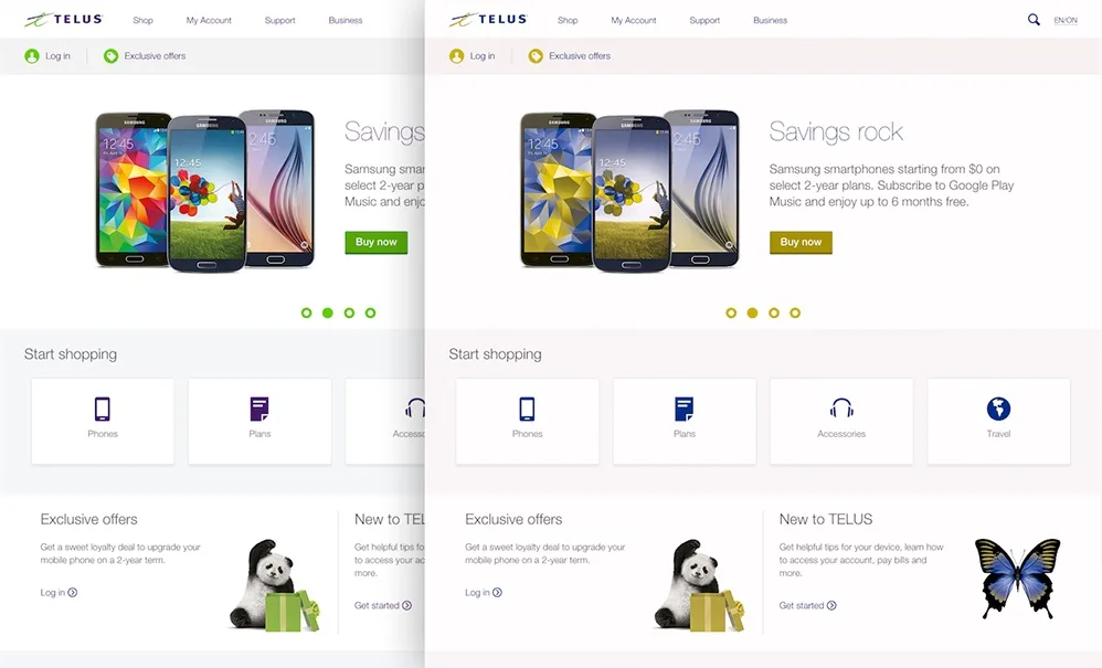
With accessibility a “must have” for the online environment, our team continues to iterate on the TELUS user experience. Refining existing patterns to follow UX best practices and align with known conventions, we seek to make the experience effortless and intuitive. For example, we’ve updated our hover state with a darker colour, to ensure users can actually see what they’re hovering over. Seems like common sense, right?

Flagging accessibility issues with WebAIM’s colour contrast tool on our defect tracker and fixing them as a part of our daily activities.
From a past of subtly-styled visual language, we aim to preserve the clean and simple principles of our brand – while evolving to become even more approachable and boldly visible to those with visual impairment, to the growing elderly population, to viewers on suboptimal displays, and to just about anyone visiting out our site from their smartphones on a sunny day. If our site is inaccessible, all our work in providing good content is wasted.
Using the Sim Daltonism tool to simulate what colour blind users see when viewing our site.
In my 2 years at TELUS digital, I’ve witnessed the rise of accessibility as a topic of concern for the team, and the transformation of how we address it in every respect. From learning about the challenges of visual, auditory, motor, and cognitive impairments, to familiarization with existing and developing assistive technologies, we are now actively using a variety of online tools, software, and resources, to detect, triage, and repair existing experiences and build towards an improved standard of online accessibility. We’re nowhere near the end yet, but we’re all onboard and on a mission to improve accessibility.
After all, this is our brand promise: The future is friendly. Let’s make it so, for ALL!